
Website editor
Mobile and tablet preview
Check how your draft looks at desktop, tablet, and phone widths before you publish.
- mobile
- tablet
- responsive
- preview
Viewport toggles
In the visual editor, switch the preview width between:
- Desktop — full width
- Tablet — about 768px
- Mobile — about 390px
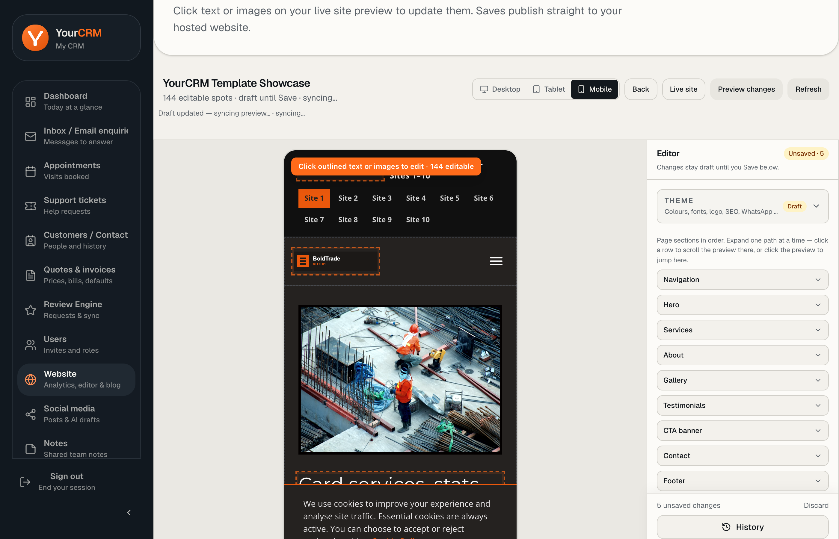
Your choice is remembered in the browser for next time.
What to check on mobile
- Hero headline still readable without huge wrapping
- Phone and CTA buttons easy to tap
- Gallery images not cropped awkwardly
- Contact details not overflowing the screen
Local customers often find you on a phone after a Maps search — mobile polish matters as much as desktop.
Still not sure?
Open the draft preview in a new tab and resize the browser, or check on a real phone after Save (or using the private draft preview URL if you have one open).